Why AI-Generated Websites Look the Same: Defaults, Probability and the Homogenisation of Web Design
AI-built websites converge on one look because three forces point the same way: inherited framework defaults, models that return the most probable output, and a feedback loop in which generated pages become training data. The convergence is older than the tools. Researchers measured it across 10,000 websites before generative AI reached design. AI accelerates it. This essay sets out the mechanisms, the evidence, the commercial cost and a practical response.
1. The observation
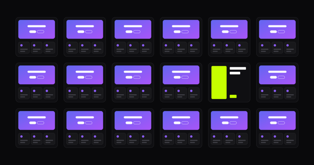
Open three AI-built landing pages and the same elements recur: an indigo-to-violet gradient, Inter as the only typeface, a centred headline above two buttons, three feature cards in a row, a small pill badge over the title. The copy promises to “elevate”, “unlock” and make things “seamless”.
Practitioners now call this “AI slop”, and most of us can identify it in under a second. The pattern is stable across tools, prompts and industries. That stability is the interesting part, because stable output implies a structural cause.
2. Homogenisation came first
The web was converging before any model generated a layout. Goree, Doosti, Crandall and Su (2021) analysed roughly 200,000 snapshots of 10,000 websites and found that layouts became measurably more alike over the 2010s. The causes they examined were shared code libraries, standardised colour schemes and the move to mobile.
This matters for how we read the present. Generative tools did not invent sameness. They were trained on a web that Bootstrap, and later Tailwind, had already pulled towards a common shape.
3. Three mechanisms
3.1 Defaults
The purple has a traceable origin. Tailwind shipped indigo as the prominent colour in its examples and UI kit, and its creator, Adam Wathan, has acknowledged publicly that this choice now colours most generated interfaces.
Behavioural science explains why one default travels so far. Johnson and Goldstein (2003) showed that organ donation consent differs enormously between countries depending only on whether consent is the preset option. People keep what they are given. Developers kept indigo, thousands of tutorials and repositories repeated it, and the models learned from all of them.
3.2 Probability
A language model returns likely continuations. Asked for “a modern landing page” with no further constraint, it produces the centre of the distribution it was trained on.
The effect is documented outside design. Doshi and Hauser (2024) gave writers story ideas from GPT-4. Individual stories were rated as more creative, yet the AI-assisted stories were more similar to one another than those written unaided. Anderson, Shah and Kreminski (2024) report a comparable narrowing in creative ideation. Each person gains and the group loses range.
Design research has an older name for part of this. Jansson and Smith (1991) described design fixation: designers shown an example reproduce its features, including its flaws. A generated first draft is exactly such an example, and it arrives before the designer has formed an idea of their own.
3.3 Recursion
Generated pages are published, crawled and absorbed into the next round of training. Shumailov and colleagues (2024) showed in Nature that models trained on the output of earlier models progressively lose the rare cases at the edges of the distribution, a process they call model collapse.
Web design is unusually exposed to this loop, because nearly everything a model generates in this field ends up public. Informal practitioner tests point the same way. One developer ran 480 generation trials and reported a consistent blue-purple bias.
4. The second-order effect
Instructing a model to look “less AI” does not produce originality. It produces the next most probable page: warm cream with a terracotta accent, or near-black with a single acid-green highlight. I note, with some discomfort, that the second describes this site.
The mechanism is unchanged. Excluding one mode of a distribution moves the output to the neighbouring mode. A prohibition is not a decision.
5. Is sameness a problem?
Not always, and the evidence should be read fairly. Goree and colleagues point out that familiar patterns can improve usability. Tuch and colleagues (2012) found that users prefer websites with high prototypicality and low visual complexity. Lindgaard and colleagues (2006) showed that judgements of visual appeal form within about 50 milliseconds. Convention helps people orient quickly.
The cost sits elsewhere. It helps to separate two layers of a page:
| Layer | Examples | Effect of convergence |
|---|---|---|
| Structure | Navigation, forms, page order, interaction patterns | Mostly helpful: users know where things are |
| Identity | Colour, typography, imagery, tone of voice | Costly: the business becomes interchangeable |
Generative tools flatten both layers at once. When a polished layout costs nothing, polish stops signalling investment. A simple test makes the point: place a competitor’s logo on your homepage. If nothing looks out of place, the identity layer has been left to the default.
6. A practical response
- Specify before generating. Give exact colours, a typeface, a radius and a spacing scale. Adjectives such as “modern” and “clean” request the average.
- Treat the first output as a fixation risk. Sketch your own direction before prompting, or generate several divergent options and compare them.
- Spend distinctiveness on the identity layer. Typography, colour and voice carry recognition. Keep conventional structure where users expect it.
- Write claims that can be sourced. One specific, verifiable statement outperforms three adjectives.
- Keep the decisions. Adoption is near universal: the AI in Design 2026 report puts weekly use at 91% of designers, which I discussed in Half of Designers Now Ship Code. The risk lies in delegating judgement along with production, as I argued in Most people will not lose their job because of AI, but because of overusing AI.
7. Conclusion
AI did not create visual sameness on the web. It industrialised a tendency that had already been measured, by combining sticky defaults, probabilistic output and recursive training. A default is a choice someone else made for a different project. The designer’s task is to make that choice again, deliberately.
References
- Anderson, B. R., Shah, J. H., & Kreminski, M. (2024). Homogenization effects of large language models on human creative ideation. Proceedings of the 16th Conference on Creativity & Cognition, 413-425.
- Doshi, A. R., & Hauser, O. P. (2024). Generative AI enhances individual creativity but reduces the collective diversity of novel content. Science Advances, 10(28), eadn5290. doi.org/10.1126/sciadv.adn5290
- Goree, S., Doosti, B., Crandall, D., & Su, N. M. (2021). Investigating the homogenization of web design: A mixed-methods approach. Proceedings of the 2021 CHI Conference on Human Factors in Computing Systems, 1-14. doi.org/10.1145/3411764.3445156
- Jansson, D. G., & Smith, S. M. (1991). Design fixation. Design Studies, 12(1), 3-11.
- Johnson, E. J., & Goldstein, D. (2003). Do defaults save lives? Science, 302(5649), 1338-1339.
- Lindgaard, G., Fernandes, G., Dudek, C., & Brown, J. (2006). Attention web designers: You have 50 milliseconds to make a good first impression! Behaviour & Information Technology, 25(2), 115-126.
- Shumailov, I., Shumaylov, Z., Zhao, Y., Papernot, N., Anderson, R., & Gal, Y. (2024). AI models collapse when trained on recursively generated data. Nature, 631, 755-759.
- Tuch, A. N., Presslaber, E. E., Stöcklin, M., Opwis, K., & Bargas-Avila, J. A. (2012). The role of visual complexity and prototypicality regarding first impression of websites. International Journal of Human-Computer Studies, 70(11), 794-811.

Written by Iordanis Passas, creative director, graphic designer and UI designer who designs with AI.